Friday, January 4, 2013

How to Enhance the architectural Beauty of problematic Windows


These two projects had problematic windows. Problematic in the sense that they were ugly in their current context.  They stuck out like a sore thumb because they were disconnected from the rest of the space.  Having too much negative/empty space around a window draws more attention to them.


This bathroom renovation was a fun challenge.  I decided to frame out the windows and incorporate them into the mirror design.  

By framing out the mirror and windows together we visually created ONE thing to look at.  

Then we took it one step further and framed up the rest of the wall above the window and added more mirror.  We created an entire wall of glass/mirror adding architectural visual interest to a space that lacked it.

AFTER BATHROOM PHOTO - Design By Erica Islas
The result is attractive windows.

We had another similar experience on another project, see here below.

BEFORE PHOTO

This Kitchen renovation also had issues with windows.  Client hated the windows; they said they hated them because it didn’t allow for them to have upper cabinets.

It was obvious that there was too much going on, the space felt busy, fussy, and the windows stood out like a soar thumb.  But I actually loved the windows… I loved their shaped and immediately envisioned upper cabinets installed horizontally under the windows.  Horizontal cabinets make it (ergonomically) easier to get to stuff.  

AFTER PHOTO-  Design by Erica Islas
Another thing to consider with windows is to connect them to something else in the space.  For example, in the Kitchen above, the windows are framed in wood, so I used a similar wood color for the lower cabinets.  Connecting the problematic windows to something else in the space helps you see the space as a whole.   

We also added a FULL backsplash all the way up to the windows. This creates another visual horizontal band.

Once the problematic windows are addressed, the rest of the renovation falls into place with a great design plan and selection of a great finishes. 

Tuesday, January 1, 2013


Happy New Year !  and say Hello to .....


Pairs beautifully with Whites and Neutrals , great with pops of Blues and Yellows.


Friday, December 28, 2012

A year in Review 2012


I am very thankful for every moment I experienced this year as it has not only made me grow, but it has also motivated me to do more, bigger and better... here's a year in review of 2012.


PHOTO by : David Young-Wolff-  Custom Design wall unit with intersecting desk design by Erica Islas. 

January 2012 started off with a bang with an amazing feature In Real Kitchens - and we landed a great renovation project because of it which we just completed and getting ready to photograph.

In February I was invited to Fashion week with Brizo , which has turned out to be one of the best business trips of my life .  I met some amazing designers on this trip and have made great friendships.  THANK YOU Brizo for this amazing opportunity .  Thank you Christian May & Brandon Smith for the nomination.

In March we received recognition : "Best of remodeling 2012 bathrooms in Los Angeles" from Houzz.com

In April Worked we worked on an Hgtv episode of House Hunter Renovations , where we used the NEW Black Matte Touch Faucet by Brizo and joined the Decor Mentor group.


In June we were featured in Small Room Decorating... Our client's home office / guest room project and started a couple new projects.

The summer was fun!  Fun filled with projects , and juggling the home life with kids beign off of school... Lucky for them they had Art Camp at the LACMA, otherwise they might of been interning at EMI Interior Design all summer long :) 

In October the HHR Episode aired  and went to I High Point Market with my amazing designer friends Michelle Workman & Shirry Dolgin.  These two woman are incredibly talented and inspiring. Very Thankful to have them in my life. 

We (EMI Interior Design Team) are very blessed and thankful to have about 14 running projects on the boards.  They are all at different stages, and as one finishes another one starts.  Some are big some are small. Some new clients and a lot of repeat clients.  

We are ending the year with a featured in Small Room Decorating -Spring 2013 issue , a perfect way to end December.

This has been an amazing year and I am thankful for all the connections I made this year with everyone, too many to name, but you all know who you are.  I am grateful.  It has been an eventful year. 

Cheers to a fabulous New year !   Excited to see what 2013 has in store.

Friday, December 7, 2012

Small Room Decorating Magazine 2013


Featured in Spring 2013 Small Room Decorating Magazine


Let's face it, when you have a small space you have no choice but to get creative to make the most of it.  It challenges us to think outside the box.

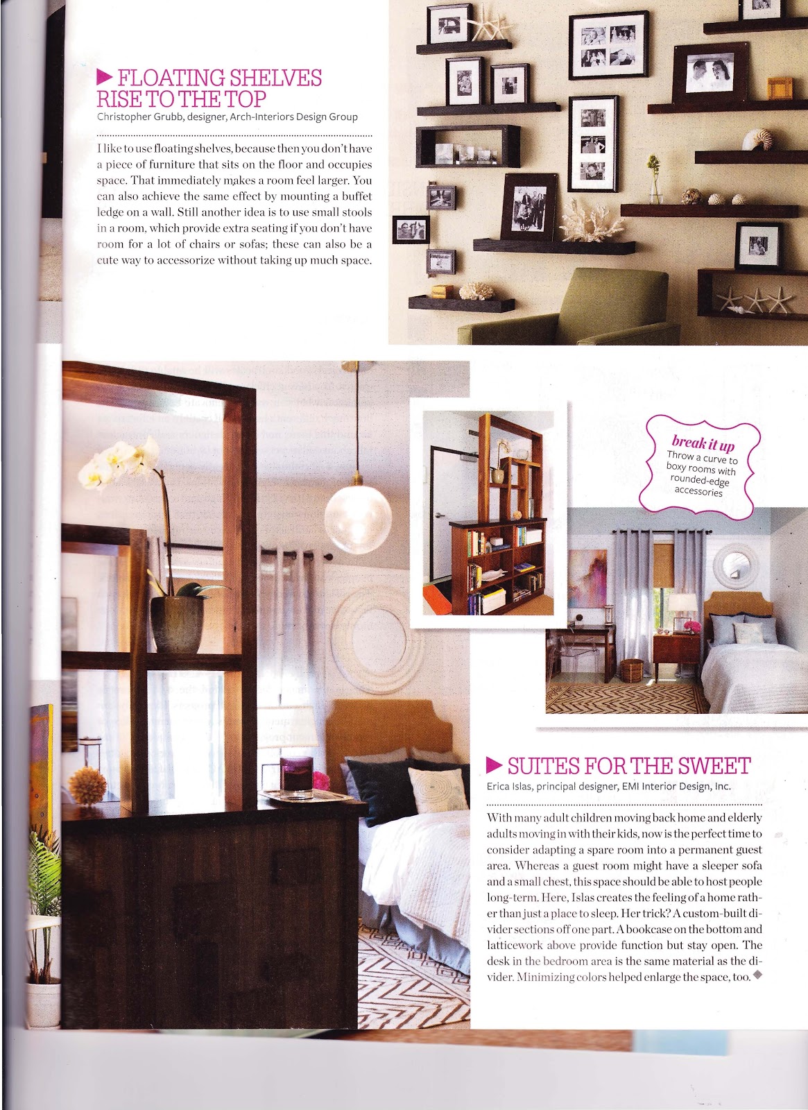
This new issue of Small Room Decorating Magazine-Spring 2013 which is on newsstands now is filled with lots of inspiring ideas on how to make your small space Big!  My work is featured on page 8 and 9.

My tips featured include:
-Build a multi-functional Divider to break up room and create spaces.

- Add layers & texture (Especially to Small spaces) with different materials & finishes .

-Use up vertical space : Take tile up to ceiling as well as shower curtains.

Thank You Small Room Decorating Magazine for including my work.